Frista
Frista – Branding for an Artisan Pasta Shop in Berlin

Project Overview
Frista is an artisan pasta shop located in the heart of Berlin, specializing in fresh pasta retail. The branding project is built around an essential and modern visual identity, conveying both the craftsmanship of the product and its connection to Italian tradition, while integrating references to German visual culture.
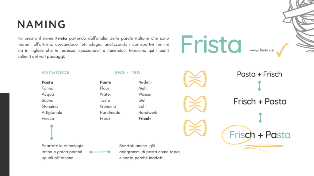
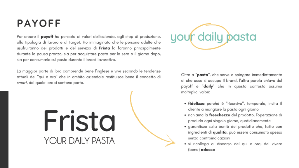
The name “Frista” is a fusion of “Frisch” (fresh in German) and “Pasta”, immediately evoking the freshness of the product and its everyday consumption. This idea is reinforced by the payoff “YOUR DAILY PASTA”, emphasizing the concept of fresh, daily-made pasta, making the brand recognizable and memorable.
Visual Identity: A Tribute to Bauhaus
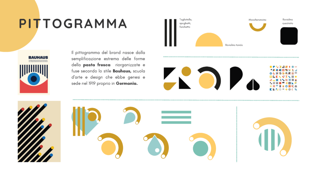
The logo and pictogram are inspired by the Bauhaus school, which was founded in Germany. The minimalist and geometric design of the brand reflects the shapes of fresh pasta, simplified and restructured to create a modern and distinctive look.
The color palette combines a pasta yellow, reimagined in a brighter and more contemporary shade, with a green that symbolizes water, a key ingredient in pasta-making. This is balanced by a deep gray, adding a touch of elegance and sophistication.
The Quicksand font, chosen for the brand, has a soft and rounded appearance, echoing the curves of fresh pasta, while the uppercase payoff maintains a clean and essential look to strengthen its visual impact.
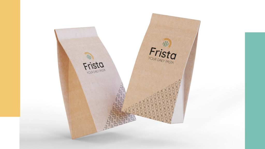
Packaging & Communication
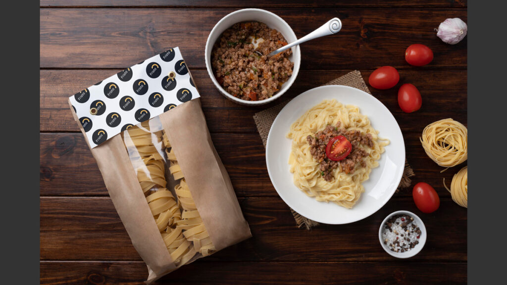
Frista’s visual identity extends to its packaging and communication, featuring a modern yet warm design that enhances the handcrafted nature of the product while maintaining the freshness and accessibility of a young and dynamic brand.

Frista – Branding per un Pastificio Artigianale a Berlino
Frista è un pastificio artigianale con vendita al dettaglio, situato nel cuore di Berlino. Il progetto di branding si basa su un’identità visiva essenziale e moderna, capace di trasmettere l’artigianalità del prodotto e il suo legame con la tradizione italiana, integrando al contempo riferimenti alla cultura visiva tedesca.
Il naming “Frista” nasce dalla fusione tra “Frisch” (fresco in tedesco) e “Pasta”, evocando immediatamente la freschezza del prodotto e il suo consumo quotidiano. Questa idea è rafforzata dal payoff “YOUR DAILY PASTA”, che sottolinea il concetto di pasta fresca prodotta ogni giorno, rendendo il brand riconoscibile e memorabile.
Identità Visiva: Un Tributo alla Bauhaus
Il logo e il pittogramma sono ispirati alla scuola Bauhaus, che nacque proprio in Germania. Il design minimalista e geometrico del marchio richiama le forme della pasta fresca, semplificate e riorganizzate per ottenere un look moderno.
La color palette combina il giallo pasta, rivisitato in una tonalità più luminosa e attuale, con un verde che richiama l’acqua, ingrediente fondamentale della pasta. Il tutto è bilanciato dal grigio scuro, che aggiunge un tocco di eleganza e valore.
Il font Quicksand, scelto per il brand, è morbido e arrotondato, in linea con le forme della pasta, mentre il payoff è in uppercase, essenziale e pulito, per rafforzarne l’impatto visivo.
Packaging e Comunicazione
L’identità visiva di Frista si estende al packaging e alla comunicazione, con un design moderno ma accogliente, che valorizza l’artigianalità senza perdere la freschezza e l’accessibilità di un marchio giovane e dinamico.